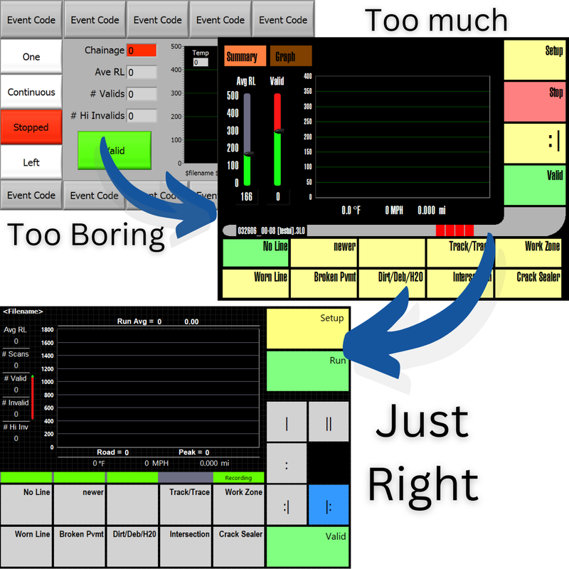
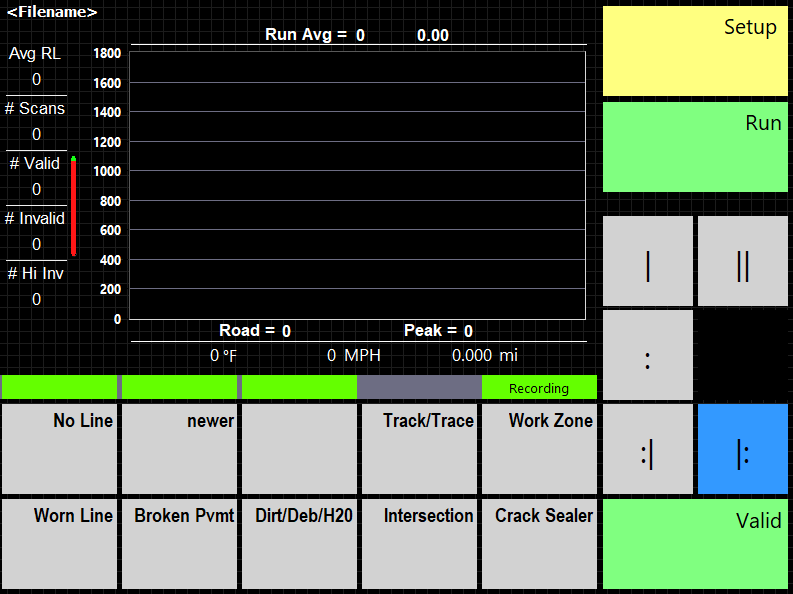
Partly as a search for contrast, and partially because of being huge Star Trek fans, we made a version with the LCARS interface. It has great contrast and it looks really cool. There were some problems, though. The font was hard to read, and some of the graphic elements are more decorative, which just wasted valuable screen real estate.
We took the best elements of LCARS and toned it down a bit to come up with a very functional high-contrast GUI that works great for the drivers.
0 Comments
Leave a Reply. |
Categories
All
|


 RSS Feed